Landing Pages for Events: 5 Strategies to Boost Engagement
Unlock the secrets to high-engagement event pages. Check out this article about landing pages and learn 5 strategies to boost your event’s success.

Creating an effective landing page for your event can make or break its success. A well-designed landing page example serves as a powerful tool to boost engagement and drive registrations.
You’ll find that a compelling event landing page not only provides essential event information but also creates excitement and encourages immediate action from potential attendees.
In this article, you’ll discover five key strategies to enhance your event landing page.
We’ll explore how to craft an engaging event description, design an eye-catching layout, and optimize your call-to-action to increase conversions.
You’ll also learn the importance of leveraging social proof and incorporating early bird discounts to motivate quick sign-ups.
By implementing these landing page ideas, you’ll be well on your way to creating a high-performing event promotion platform that turns visitors into eager participants.

Craft a Compelling Event Description
A well-crafted event description has a significant impact on attendance rates and serves as a powerful marketing tool.
It’s more than just a summary of what, when, and where your event is happening.
Your description should attract and persuade your target audience to register, attend, and share your event.
To create an engaging event description, consider the following strategies:
Highlight key benefits
Start by showcasing what makes your event stand out. These selling points should be the focal point of your description. Emphasize the unique aspects of your event that will appeal to your target audience.

For example, you might highlight exclusive networking opportunities, expert speakers, or hands-on workshops.
By focusing on the benefits, you’ll help potential attendees understand the value they’ll gain from participating in your event.
Use persuasive language
Your event description is an extension of your brand, so use language that reflects your event’s personality and appeals to your audience.
Be clear and concise, avoiding unnecessary jargon. Use action-oriented words and phrases that create excitement and urgency.
For instance, instead of saying “Our event will have speakers,” try “Gain insights from industry-leading experts.”
This approach helps potential attendees envision themselves at your event and motivates them to take action.
Include social proof
Incorporating social proof in your event description can significantly boost credibility and encourage registrations.
If applicable, include testimonials or highlight the success of past events.
Sharing positive feedback adds credibility and reassures potential attendees that your event is well-regarded within the community.
For example, you might include a quote from a previous attendee or mention the number of people who attended last year’s event.
This social proof serves as a powerful trust signal, instilling confidence in prospective participants [1].
Design an Eye-Catching Visual Layout
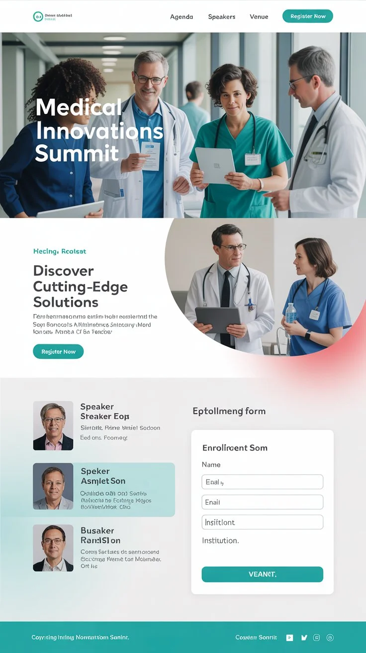
To create an engaging landing page example for your event, you need to focus on crafting a visually appealing layout.
A well-designed page can significantly boost engagement and drive registrations.
Here are some strategies to help you design an eye-catching visual layout for your event landing page.
Use high-quality event imagery
High-quality images play a crucial role in capturing visitors’ attention and increasing engagement.
When people land on your page, they’re more likely to explore it in depth if the images are engaging and relevant to their interests.
Use professional photos that showcase the energy and experience of your event.
If you’ve held this event before, include pictures from past gatherings to give potential attendees a better idea of what to expect.
You can also use graphic design to create posters or infographics that highlight your event’s appeal or agenda.
Create a clean, scannable design
A simple, uncluttered page is more inviting and easier to navigate. Remove any unnecessary elements and keep your content concise.
Use plenty of white space to make the page appear open and airy.
A clean design will make a great first impression on visitors and help them quickly find the information they need.
Make sure your page has a logical layout and hierarchy to guide people to the most important details and help them register as quickly as possible.
Incorporate brand colors
To create a cohesive brand identity, incorporate your logo and brand colors into the event landing page design.
Use a color scheme that’s consistent with your other marketing materials.
This helps build relationships with your audience and increases awareness of your organization.
Consider using your brand colors in various elements such as backgrounds, buttons, and text to create a visually appealing and cohesive look.
Optimize Your Call-to-Action
To boost engagement on your event landing page, it’s crucial to optimize your call-to-action (CTA).
A well-crafted CTA can significantly impact your conversion rates and drive registrations for your event.
Here are some strategies to enhance your CTA and make it more effective.

Make CTAs prominent and clear
Your CTA should grab visitors’ attention immediately.
Use a combination of font, design, and strategic placement to ensure your CTA button stands out from the rest of the content.
Make it visually appealing and easy to spot, even during a quick skim of the page.
Consider using contrasting colors that align with your brand to make the CTA pop.
Remember, the goal is to guide potential attendees towards taking action.
Use action-oriented language
When crafting your CTA, use strong, action-oriented verbs that clearly communicate what you want visitors to do.
Instead of generic phrases like “Click here,” opt for more specific and compelling language such as “Reserve Your Spot” or “Get Your Ticket Now.”
This approach not only tells readers exactly what to do but also motivates them to take immediate action.
Keep your CTA concise, ideally between two to five words, to maintain clarity and impact.
A/B test button colors and placement
To maximize the effectiveness of your CTA, conduct A/B tests on various elements, if possible.
Experiment with different button colors, shapes, and placements to see what resonates best with your audience.
For instance, you might test a green button against an orange one, or compare rounded corners to square edges.
Additionally, try different locations on the page, such as above the fold or at the end of your event description.
By analyzing the results of these tests, you can refine your CTA to achieve the highest possible conversion rates for your event landing page.
Leverage Social Proof and Testimonials
Social proof is a powerful tool to boost engagement on your event landing page.
By showcasing positive experiences from past attendees, you can build trust and credibility with potential participants.
Here are some effective strategies to leverage social proof and testimonials:
Feature past attendee quotes
Include testimonials from previous event attendees on your landing page. These quotes should highlight the value and benefits of attending your event.
According to a survey by Qualtrics, 92% of consumers read testimonials when considering a purchase, and 88% trust these testimonials as much as personal recommendations [2].
Choose testimonials that are specific and relevant to your target audience.
For example, you might include a quote like, “This event provided actionable insights that helped me grow my business by 30% in just six months!”
Showcase speaker credentials
Highlight the expertise and accomplishments of your event speakers.
This helps establish credibility and demonstrates the value of attending your event.
Include brief bios, professional achievements, and any notable publications or awards.
You can also feature quotes from speakers about what attendees can expect to learn or gain from their sessions.
Display logos of sponsors/partners
Featuring logos of well-known companies or organizations associated with your event can significantly boost credibility.
According to a case study by BrightLocal, including client logos on landing pages can increase conversions by up to 15% [3].
Prominently display these logos in a dedicated section of your landing page.
This visual representation of support from reputable brands can help build trust and encourage potential attendees to register for your event.
Conclusion
In the end, creating an effective landing page for your event is a blend of art and science.
By focusing on crafting an engaging description, designing an eye-catching layout, optimizing your call-to-action, leveraging social proof, and incorporating early bird discounts, you’re setting the stage for a successful event.
These strategies have a significant influence on boosting engagement and driving registrations, ultimately leading to a more impactful and well-attended gathering.
Remember, your landing page is often the first point of contact between potential attendees and your event. Making it compelling and user-friendly is crucial to turn visitors into eager participants.
If you’re looking to create a landing page that truly stands out, consider contact WebPriuli for expert guidance on crafting a successful event landing page.
By putting these ideas into action and continuously refining your approach, you’ll be well on your way to hosting events that leave a lasting impression on your audience.
FAQs
How can engagement on a landing page be enhanced?
To enhance engagement on a landing page, consider identifying and resolving any friction points, ensuring the content is not misleading, improving targeted traffic, and designing for both mobile and desktop compatibility. Additionally, increasing site speed, creating readable content, and avoiding unnecessary pop-ups can significantly boost engagement.
What are some effective strategies for creating an engaging landing page?
Creating an engaging landing page involves using eye-catching headlines, maintaining simplicity, and incorporating a clear call to action (CTA). It’s also beneficial to optimize the page for mobile users, include engaging media such as images and videos, provide value upfront, incorporate social proof, and personalize the content for the visitor.
What are the key elements in writing an effective event landing page?
An effective event landing page should be planned with a clear conversion goal and target audience in mind. It should highlight essential event details, include a strong call to action, encourage social sharing, and feature a straightforward registration form. Keeping the content concise and displaying social proof are also crucial elements.
Can you provide an example of a well-designed landing page?
A prime example of a well-designed landing page is Netflix’s sign-up page. This page effectively communicates the service offerings and features a clear and prominent call to action, “Get Started,” which invites visitors to create an account or resume their paused membership.
References
[1] – https://www.nudgify.com/social-proof-landing-pages/
[2] – https://getwpfunnels.com/event-landing-page-examples/
[3] – https://www.optimizepress.com/event-landing-page-examples/


